asianfuse.net (base domain)

darvil

sarNie Adult
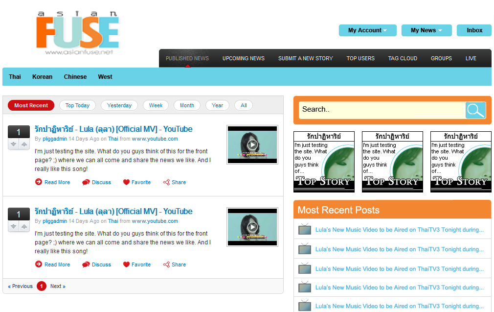
I've always wanted to do a vote site on asian entertainment. Its as simple as someone posting a link to an article, video, picture with some comments. Then the rest of us can vote it up if we like it or downvote it if we don't and also make comments on it if we want. Anything entertainment is welcomed to put on there.


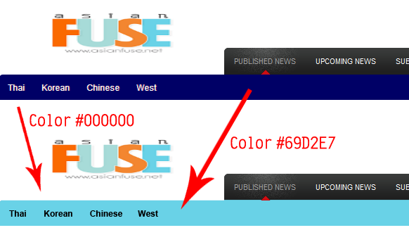
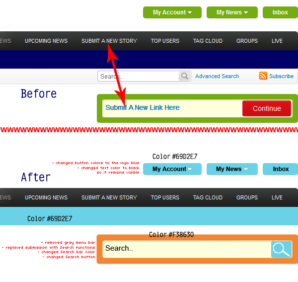
I'm still slowly working on it. As you can see it needs some more work. First I'm not good at all with colors scheme. Any suggestions on this? Fonts? Font colors? Font sizes? Should I change the words (Thai, Korean, etc..) on it? Add more categories?? What do ya'll think?

Integration is somewhat done so when someone is already logged into the forum, an account is automatically created. That way nobody has to re-register for the new site. Its kinda like how the wiki works. I see a few of you guys have already visited the site and it made those user accounts automatically.

Anyone here dig this idea as much as me?
 

rukD2B

Bai Yang [♥] Fong T. Xiong
No replies YET? xD

Here are my suggestions/recommendations, it’s quite a load so don’t get angry! LOL, you asked for it. D:

I will work from top to bottom so it won’t seem like I’m jumping around. I know that you installed a skin for starters, but you should change the color scheme here and there. Like I’ve already mentioned to you, it would be wise to contact the original artist of the AF logo and have it resized so it looks proportional.

In addition, here is what I recommend first. In order for the website to go big, I think that it would require some professionalism (joke). I would change the color of this menu bar. Here is a preview of what it would look like.


I also think that there are too many menu bars at the top. You’ve got the My Account/My News/Inbox and then you’ve got the black one, then the blue one, then the gray one. It’s so much that it looks disorganized, not to mention that a lot of the links are repetitive. It reminds me of a browser with a ton of toolbars installed, LOL. My suggestion would be to remove the bottom gray menu bar. It is convenient to have a search bar on the front page so I would say that it is a must. But if you remove the gray menu, you lose it. I would get rid of the “Submit A New Link Here” because you already have a “SUBMIT A NEW STORY” on the first menu bar; and then, replace the green one with a search bar. Here’s a preview of what I recommend.


The next thing I’d address is the super busy right-side panel that we talked about. There are so many “Top this,” “Top that,” “Top etc.” However, there is already an existent “TOP USERS” on the black menu bar up top. Again, I think that it is too repetitive so I would choose to completely remove all of them and replace them with something else. I would also remove the little “Inbox” link at the bottom too because there is already an Inbox button up top. HOWEVER, you could replace it with one of those “Back to top” kind of links. =) Along with those modifications, the three “125 x 125” boxes are kind of eye-catching because they’re big boxes, up top, and to the side. Like I said, I would turn those into a “Top Stories” kind of panel. Here is an example.


These images will link the user to the top 3 most popular posts. You might, however, need someone to frequently update them (i.e. make the graphics, upload them to replace the new ones).

Also, you could add a little gadget on the right-side panel where users could subscribe to new updates, etc. Since those three images display the top 3 most popular posts, you could have a gadget that displays the most recent posts too.

See what you think. It may be a bit much, especially since I just did little visual adjustments because I know that there’s a lot of coding behind the works of what the users see. Whether or not you like the changes I suggested above, I think that if you coordinate all the menu bars and texts accordingly to the AF signature logo, it will looks more like one whole piece put together, helping it to appear more professional and "cleaner." Rather than a logo plus a randomly chosen skin. Does that make sense? @___@
 

rukD2B

Bai Yang [♥] Fong T. Xiong
*Not sure if you noticed but the "Continue" button also changed from red to that same shade of blue. I think that it helps better to tie everything in. Let me know if you want a full view. I could do a whole edit of the front page screen shot.
 

Thookatha

sarNie Elites
dang, haibtuag, that's some high level thinking! I'm not sure what language it is, but i like it! lol do what haibtuag says, darvil!
 

rukD2B

Bai Yang [♥] Fong T. Xiong
Thats a yes!
Wasn't sure what you meant by that, but here is a full page preview.

- Again, you should probably changed that "Inbox" link at the bottom to "Back to top" and link it accordingly. I didn't show it in my edits but it would be smart to do so since there will be a lot of scrolling up and down once people start posting. =)

- As indicated in the image, I removed the mini-toolbar above the posts. I just didn't find it necessary since you you've got those links in the toolbars and buttons above. (I'm saying this because I'm not sure how you'd remove it, but it's up to you, just see if you like it.)

- And I chipped in an idea for something to fill in the right-hand panel since it would be lonely once you delete all those Top picks kind of tables/lists/toolbars.

- Lastly, I resized the AF logo but from what I remember, you could just go into the style sheets and change the dimensions of the logo rather than having the designer re-create it. It'd look better if it was bigger anyway, IMO, because it'll really claim that the page belongs to AF! ;D

Here is the final suggestion:

 
Top